A quick overview of what is CSS Modules, how it works, how it’s used together with React, plus some useful tips.
What is CSS Modules?
A CSS Modules is a CSS file in which all class names and animation names are scoped locally by default.
CSS Modules is not an official specification nor a standard. It’s a sort of step in CSS/JavaScript building process, which modifies CSS classes by appending some unique hash, thus ensuring, that your CSS styles are locally scoped and don’t overlap with each other.
How does CSS Modules work?
Your original CSS file will be compiled into a special ICSS (Interoperable CSS) format, which outputs CSS styles and JavaScript Object.
- CSS styles: compiled CSS with modified class names.
- JavaScript Object: used to map original class names to modified class names.
Most of the module bundlers, such as webpack, parcel etc support CSS Modules through plugins or loaders.
Also, create-react-app supports CSS Modules out of box.
Example:
/* styles.css */
.container {
  font-size: 16px;
  // ...
}

/* index.js */
import styles from "./style.css";
//..

element.innerHTML = '<div class="' + styles.container + '">';


/* output HTML */
<!-- ... -->
  <div class="styles_container_g2x5j" />
<!-- ... -->
See, how original class name .container was renamed to a .styles_container_g2x5j, in order to scope CSS locally and avoid class name conflicts.
Note:
.styles_container_g2x5jis just an example. It’s possible to configure CSS modules compiler class name generation pattern/function.
Using with React
Using CSS Modules in React is really straight forward.
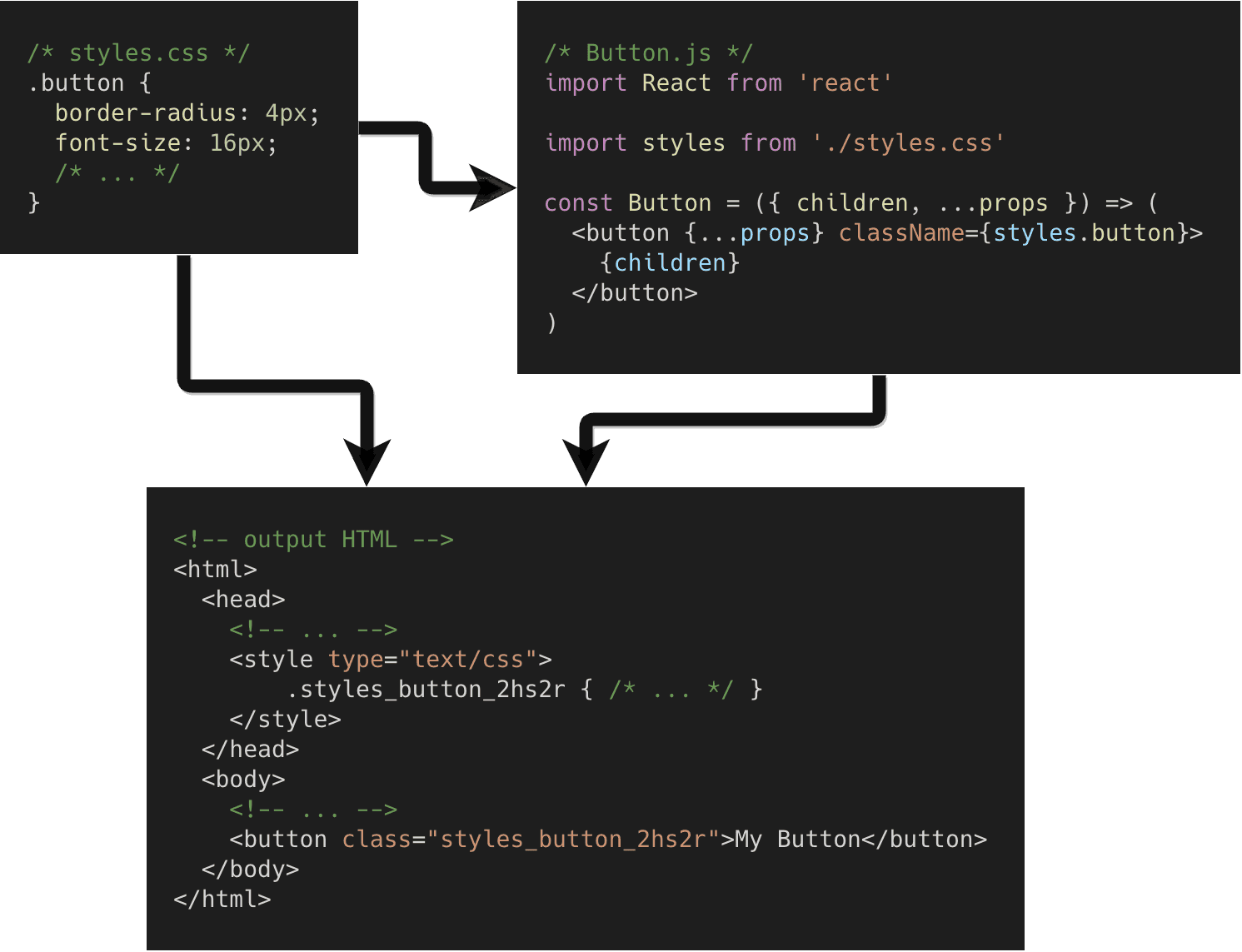
/* Button/styles.css */
.button {
  // ...
}

/* Button/index.js */
import React from 'react'
import styles from './styles.css'

const Button = ({ children, ...props}) => (
  <button className={styles.button} {...props}>{children}</button>
)
Multiple classNames
/* App/styles.css */
.container { /* ... */ }

// Note: you can use dash case class names and access them using styles['is-dark'] in js
.isDark { /* ... */ }

.title { /* ... */ }

.description { /* ... */ }

/* App/index.js */
import React from 'react'
import styles from './styles.css'

const App = () => (
  <div className={[styles.title, styles.isDark].join(' ')}>
    <h1 className={styles.title}>Title</h1>
    <p className={styles.description}>Description</p>
  </div>
)
Conditional classNames
/* App/styles.css */
.container { /* ... */ }

.title { /* ... */ }

.description { /* ... */ }

// Note: you can use dash case class names and access them using styles['is-dark'] in js
.isDark { /* ... */ }

/* App/index.js */
import React from 'react'
import styles from './styles.css'

const App = ({ isDark }) => (
  <div className={[styles.container, ...(isDark ? styles.isDark : [])].join(' ')}>
    <h1 className={styles.title}>Title</h1>
    <p className={styles.description}>Description</p>
  </div>
)
Simplifying things with “classnames”
Probably, you’ve already noticed that multiple and conditional class names don’t look nice, and seem to a bit overcomplicated.
One way to solve this is to create some utility functions to work with styles object.
However, there’s already such npm package called classnames.
/* App/styles.css */
.container { /* ... */ }

.isDark { /* ... */ }

.title { /* ... */ }

.description { /* ... */ }

.isUppercase { /* ... */ }

/* App/index.js */
import React from 'react'
import cx from 'classnames'
import styles from './styles.css'

const App = ({ isDark }) => (
  <div className={cx(styles.container, { [styles.isDark] : isDark })}>
    <h1 className={styles.title}>Title</h1>
    <p className={cx(styles.description, styles.isUppercase)}>Description</p>
  </div>
)
Simplifying things further with “babel-plugin-react-css-modules”
So far when using classnames npm package code looks much better.
However, it’s still a bit different from what just regular HTML/CSS classes look like when we just write <div class="foo bar">...</div> .
There is babel-plugin-react-css-modules which brings back that functionality into CSS Modules.
In short, babel-plugin-react-css-modules transforms styleName to className using compile time CSS module resolution.
Basically, with babel-plugin-react-css-modules, we can provide original class names to a special styleName attribute and plugin replaces them with modified class names in build time.
/* App/styles.css */
.container { /* ... */ }

.isDark { /* ... */ }

.title { /* ... */ }

.description { /* ... */ }

.isUppercase { /* ... */ }

/* App/index.js */
import React from 'react'
import cx from 'classnames'
import './styles.css'

const App = ({ isDark }) => (
  // Note: that { "isDark": isDark } was simplified to just { isDark }
  <div styleName={cx('container', { isDark })}>
    <h1 styleName="title">Title</h1>
    <p styleName={cx('description', 'isUppercase')}>Description</p>
  </div>
)
Conclusion
CSS Modules and React plays very well and, most importantly, solves the issue of having global styles and class name overlapping, while keeping CSS and JS separate.
However, there is another approach for creating locally scoped styles, which is called CSS in JS. There are plenty of implementations/libraries of CSS in JS such as styled-components, emotion, JSS, etc. The choice between CSS Modules and CSS in JS is a matter of preference of a developer or team, and of course, consistency within a project.