In this example, we will be creating a customizable Modal component with React.
Getting Started
First, let’s see how we want to use our Modal component:
// ModalExample/index.js
import React, { useState, useCallback } from "react"
import Modal from "../Modal"

import styles from "./modal-example.module.css"

export const Example = () => {
  const [isOpen, setIsOpen] = useState(false)
  const handleOpen = useCallback(() => setIsOpen(true), [])
  const handleClose = useCallback(() => setIsOpen(false), [])
  return (
    <div>
      <button onClick={handleOpen}>Show Modal Example</button>
      <Modal
        isOpen={isOpen} // modal visibility
        onDismiss={handleClose} // handle clicking outsite of the modal content
        className={styles.ModalOverlay} // customize overlay element
      >
        <Modal.Content
          className={styles.ModalContent} // customize content element
        >
          I'm a fancy Modal
        </Modal.Content>
      </Modal>
    </div>
  )
}
Note that we’re using Modal and Modal.Content. This way we’ll be able to customize from outside both background overlay and modal content element.
Caveats
One of the best practices for displaying a Modal element is to render it in the body tag instead of inline rendering inside the parent component.
Reasons are:
- To avoid issues with
z-index. - To have the ability to show Modal even when the parent element is set to
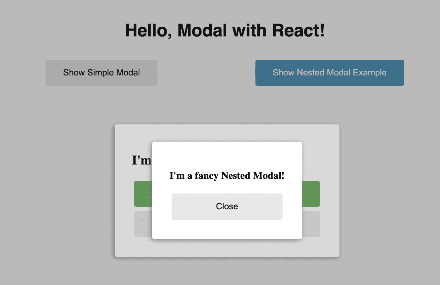
visibility: hidden. - To avoid issues when showing nested Modal inside another Modal.
In a simple scenario, we could just append Modal directly to the body element. However, there’s a more graceful way of doing it using a special Modal.Host component, where we’ll be rendering all Modal(s). This way we have more flexibility and control on where exactly to render Modal by just moving Modal.Host wherever we want Modal to be rendered:
// App.js
import React, { Fragment } from "react"
import ReactDOM from "react-dom"
import ModalExample from "./ModalExample"
import Modal from "./Modal"

import styles from "./app.module.css"

const App = () => (
  <Fragment>
    <main className={styles.App}>
      <h1>Welcome to Modal Example!</h1>
      <ModalExample />
    </main>
    {/* Host element which will render all Modals using React.Portal */}
    <Modal.Host />
  </Fragment>
)

ReactDOM.render(<App />, document.getElementById("root"))
Prerequisites
reactandreact-domclassnames— just for convenient usage of CSS modules with React
Let’s start coding.
Implementing Modal Component
Overall Modal implementation will contain:
- Modal/common.js: contains shared stuff
- Modal/ModalHost.js: contains
Modal.Hostcomponent - Modal/ModalContent.js: contains
Modal.Contentcomponent - Modal/index.js: contains the main Modal component
- Modal/modal.module.css: contains CSS styles (CSS Modules)
Modal/common.js
// Modal/common.js
import { createContext } from "react"

/* Identifier is needed to find host element when rendering using React Portal */
export const HOST_ELEMENT_ID = "modal-host"

/* Context for "Modal" <-> "Modal.Content" communication */
export const ModalContext = createContext({})
Modal/ModalHost.js
// Modal/ModalHost.js
import React from "react"
import { HOST_ELEMENT_ID } from "./common"

/* Host element which will contain all rendered modals */
export const ModalHost = (props) => <div {...props} id={HOST_ELEMENT_ID} />
Modal/ModalContent.js
// Modal/ModalContent.js
import React, { useContext, useRef, useEffect, useCallback } from "react"
import cx from "classnames"
import { ModalContext } from "./common"

import styles from "./modal.module.css"

/* Triggers a callback when clicking outside of "ref" and inside of "parentRef" */
function useOutsideClick(ref, parentRef, callback) {
  const handleMouseDown = useCallback(
    (e) => {
      e.preventDefault()
      if (ref && ref.current && ref.current.contains(e.target)) {
        return
      }
      callback && callback()
    },
    [callback, ref]
  )

  useEffect(() => {
    const parentElem = parentRef.current
    parentElem.addEventListener("mousedown", handleMouseDown)
    /* clear previous event listener */
    return () => parentElem.removeEventListener("mousedown", handleMouseDown)
  }, [handleMouseDown, parentRef])
}

/* Modal.Content component */
export const ModalContent = ({ className, ...props }) => {
  const ref = useRef(null)
  const { onDismiss, parentRef } = useContext(ModalContext)
  useOutsideClick(ref, parentRef, onDismiss)

  return (
    <div className={cx(styles.ModalContent, className)} ref={ref} {...props} />
  )
}
Modal/index.js
We will use React Portal to render Modal outside of its parent element, specifically in Modal.Host.
/ Modal/index.js
import React, { useRef } from "react";
import ReactDOM from "react-dom";
import cx from "classnames";
import { HOST_ELEMENT_ID, ModalContext } from "./common";
import { ModalHost } from "./ModalHost";
import { ModalContent } from "./ModalContent";

import styles from "./modal.module.css";

/* Checks if in browser environment and not in SSR */
const isBrowser = () =>
  !!(
    typeof window !== "undefined" &&
    window.document &&
    window.document.createElement
  );

/* Main Modal component */
const Modal = ({ isOpen, onDismiss, children, className, ...props }) => {
  const ref = useRef(null);
  if (!isOpen) {
    return null;
  }
  const hostElement = document.getElementById(HOST_ELEMENT_ID);

  const content = (
    <ModalContext.Provider value={{ onDismiss, parentRef: ref }}>
      <div className={cx(styles.Modal, className)} ref={ref} {...props}>
        {children}
      </div>
    </ModalContext.Provider>
  );

  /* React Portal is not suppored in SSR: https://github.com/tajo/react-portal/issues/217*/
  if (hostElement && isBrowser()) {
    return ReactDOM.createPortal(content, hostElement);
  }

  /* fallback to inline rendering */
  console.warn('Could not find "<Modal.Host />" node.\n Switched to inline rendering mode.');

  return content;
};

export default Modal;
Modal/modal.module.css
/* Modal/modal.module.css */
.Modal {
  background-color: rgba(0, 0, 0, 0.1);
  position: absolute;
  left: 0;
  top: 0;
  width: 100%;
  height: 100%;
}

.ModalContent {
  background-color: #cdcdcd;
  border-radius: 4px;
  margin: 4px;
  padding: 32px;
  box-shadow: -2px 2px 8px gray;
  position: absolute;
  left: 50%;
  top: 50%;
  transform: translate(-50%, -50%);
}
Summary
Check out the complete example in Github Repo.